Logos with acronyms are among the most popular branding styles used by businesses, organizations, schools, nonprofits, and technology companies. Instead of displaying a long company name, these logos use the initials of the brand to create a clean, memorable, and professional identity.
Famous companies around the world have successfully built their brands using acronym-based logos, proving that a few letters can become instantly recognizable symbols.
What Are Logos with Acronyms?
An acronym logo is a logo that uses the first letters of a company’s name or phrase rather than the full name.
For example:
- IBM
- BMW
- NASA
- CNN
These organizations use abbreviated names because they are easier to remember and more visually appealing in branding materials.
Why Businesses Use Acronym Logos
Many organizations have long names that can be difficult to display on websites, products, business cards, and advertisements.
Using an acronym logo helps:
- Improve brand recognition
- Simplify communication
- Create a modern appearance
- Save design space
- Enhance memorability
For example, most people recognize “IBM” more quickly than “International Business Machines.”
Types of Acronym Logos
Lettermark Logos
Lettermark logos use initials as the primary visual element.
Examples include:
- IBM
- CNN
- HBO
These logos rely on typography and brand recognition.
Monogram Logos
Monogram logos combine multiple letters into a single visual design.
Examples:
- Luxury brands
- Fashion companies
- Personal brands
Monograms often appear elegant and professional.
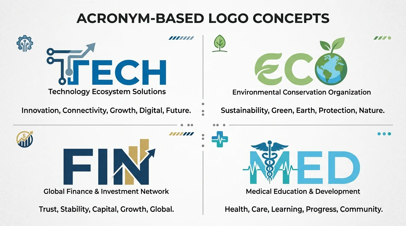
Symbol Plus Acronym
Some brands combine an icon with acronym text.
Examples:
- NASA
- BMW
The symbol strengthens visual recognition while the acronym provides clarity.
Famous Logos with Acronyms
IBM
Known for its iconic striped lettermark logo, IBM demonstrates how a simple acronym can become globally recognized.
BMW
BMW uses its three-letter acronym alongside a circular emblem recognized worldwide.
NASA
NASA’s logo combines its acronym with a unique space-inspired symbol.
CNN
CNN uses a connected-letter logo that is instantly recognizable in media.
HBO
The HBO logo demonstrates the power of simplicity in branding.
Benefits of Acronym Logos
Easy to Remember
Short letter combinations are often easier for audiences to recall.
Example
People may remember “BMW” more easily than its full German name.
Professional Appearance
Acronym logos often create a clean and modern visual identity.
Better Scalability
Short logos work well on:
- Websites
- Mobile apps
- Business cards
- Social media profiles
- Product packaging
International Appeal
Acronyms are often easier to recognize across different languages and cultures.
Design Principles for Acronym Logos
Use Readable Typography
The letters should remain clear at all sizes.
Good Choices
- Sans-serif fonts
- Bold letterforms
- Balanced spacing
Keep It Simple
Simple designs are often more memorable.
Avoid:
- Excessive decoration
- Complex effects
- Hard-to-read lettering
Create Strong Contrast
Use colors and spacing that improve visibility.
Ensure Versatility
The logo should look good in:
- Black and white
- Color
- Small formats
- Large displays
Industries That Commonly Use Acronym Logos
Technology
Examples:
- IBM
- HP
- AMD
Government Agencies
Examples:
- NASA
- FBI
- CIA
Media Companies
Examples:
- CNN
- HBO
- BBC
Educational Institutions
Many universities and colleges use initials in their branding.
Nonprofit Organizations
Acronyms help simplify long organizational names.
Common Mistakes in Acronym Logo Design
Using Too Many Letters
Long acronyms can be difficult to remember.
Better Approach
Use 2–5 letters when possible.
Poor Typography
Unreadable fonts reduce brand recognition.
Lack of Uniqueness
Generic letter combinations may blend in with competitors.
Overcomplicated Design
Simple logos often perform better than complex designs.
How to Create an Effective Acronym Logo
Step 1: Identify Your Initials
Choose the most recognizable letters from your brand name.
Step 2: Select a Font
Use a professional and readable typeface.
Step 3: Add Visual Identity
Consider a symbol, shape, or color scheme.
Step 4: Test Across Platforms
Ensure the logo works on websites, mobile devices, and printed materials.
Step 5: Maintain Consistency
Use the same logo style across all branding channels.
Future Trends in Acronym Logos
Modern acronym logos increasingly focus on:
- Minimalist design
- Responsive branding
- Digital-first layouts
- Simple typography
- Strong brand recognition
As businesses continue expanding online, acronym logos remain one of the most effective branding strategies.
Final Thoughts
Logos with acronyms are a powerful branding solution for organizations with long names or global audiences. Companies and organizations like IBM, BMW, NASA, CNN, and HBO have demonstrated how simple initials can become iconic brand identities.
When designed correctly, acronym logos offer clarity, memorability, professionalism, and versatility. Whether you’re creating a logo for a business, nonprofit, startup, or personal brand, an acronym logo can provide a strong and lasting visual identity.